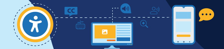
Website accessibility is sadly an overlooked design element causing millions of users to have the inability to perform common tasks. Tasks including attending online classes, paying bills, doing taxes, and ordering a pizza are all real-world examples that resulted in legal action. Unfortunately, it seems many sites design and develop first then add accessibility later. This formula is much more challenging and costly to a company rather than including it in the design from the beginning. The goal of this blog is to inspire fellow developers to think about accessibility during development.
A Short History
The Web Content Accessibility Guidelines (WCAG 1.0) was first published in 1999 (The current WCAG is 2.2 and the project I was assigned to followed 2.1). Knowing that, one would think the internet world has a firm grasp on accessibility, but this is not the case. WebAIM (Web Accessibility in Mind) did a study from 2023 that showed 96.3% of the home pages from the top 1 million websites had WCAG 2 failures. Another survey for screen reader users was conducted in December of 2023 through January of 2024. One question from this survey was, “Which of the following do you think would have a better impact on improvements to web accessibility? Better assistive technology or better (more accessible) websites?” Surprisingly, 85.9% answered “Better, more accessible websites”. Why is this a problem? There are many reasons why: different standards around the globe, varying awareness of accessibility standards, constant creation of websites making it hard to monitor, etc.
What inspired me to write this?
The idea of helping people and the obvious need for more accessibility from those surprising numbers above was my source of inspiration. I am also inspired by an experience I had back in the early 2000s. My mother owned a business at the time, and she hired a web developer to build and maintain her website. This developer had been in a wheelchair his entire life due to a degenerative disease. He had minimal use of his right hand and was able to operate his wheelchair with a few sensors on his wheelchair table. He did all his typing using speech recognition software like Dragon and used a large track ball with large buttons to navigate. It was inspiring to see him work with almost no issues blocking him.
Where is a good place to start thinking about accessibility?
I started with myself and my preferences. I have high sensitivity to light and suffer from migraines, so dark mode and low brightness are essential for me. I am also slightly colorblind, so a good contrast in colors is always beneficial for my user experience.
Starting with yourself is easy, now understand who you are trying to help. These are users with a wide range of disabilities like a loss of a limb or cognitive condition, a short-term condition like a broken hand or migraine headache, or even a situation where the user is caring for a family member and their interaction with the site is limited. I had so many thoughts rolling around in my brain when starting this project, for example, the difference between sighted and non-sighted users. Some sighted users cannot see colors well or need to have a high zoom percentage. Non-sighted users may need a screen reader to help them navigate. It is hard to say what constitutes a sighted versus a non-sighted user as there are varying degrees of sight and overlap in tools used between the two sets of users. Users with a physical impairment are another example. A user may not be able to use a mouse either from injury or condition and rely on keyboard navigation. Some users have short-term memory issues from an accident and need proper labeling and/or instructions to help them complete tasks. Perhaps a user needs the screen reader and speech viewer to both hear and read information about the element they have selected.
Understanding P.O.U.R
- Perceivable – The information and components must be presented so that no information will be invisible to the user. Offer text alternatives that allow users to consume the content such as larger print, simpler terms (no abbreviations, acronyms, etc.), translations, or compatibility with screen readers or refreshable braille displays.
- Operable – All elements must be operable to the user in multiple ways. For example, make sure the site is keyboard accessible for users who are unable to use a mouse.
- Understandable – All information must have adequate context to be understandable. Provide labels and instructions for items like forms, buttons, and tables. Blind or low vision users may not have visual context so labeling must be present.
- Robust – All content present must be understandable to assistive tools like screen readers. Make sure to follow proper html semantics for assistive technologies to adequately perceive the content.
Challenges
There are numerous challenges from the developer’s point of view such as understanding all the accessibility tools available, knowing their caveats, the WCAG overall, and testing. Here are some of the challenges that need to be understood.
- HTML semantics – Proper HTML structure is paramount for accessibility. Poor HTML causes the site to be inaccessible and can be damaging, cause confusion, and even trap the user. Make sure all interactive elements are keyboard accessible (i.e.
<a>should have an href and buttons should have event listeners.) A lot of non-sighted/keyboard users navigate by headers, so use these options<h1>to<h6>properly as these are not just for sizing. Things like a media player or table must not improperly trap focus to where the user cannot move out of where the focus is being trapped. Bottom line, confusion can happen very easily from poor html so design accordingly. - Testing – Unfortunately, there is not a lot of automated testing. Testing is mostly conducted manually. From a recent project, our team generally had at least three people testing changes before marking a ticket complete. This generally worked well, but several things came up that forced us to go back and make additional fixes.
- Screen readers – Not all function the same and some do not work well, so be careful when choosing. There are recommended screen readers like JAWS (Job Access With Speech) and NVDA (NonVisual Desktop Access), but even these can present some interesting behavior. From my experience using NVDA, keyboard operability is impacted with and without the screen reader active in certain places. Sometimes the screen reader seemed to add keyboard operability. Be careful and test everything with the screen reader both on and off. Screen readers also pose security risks with private information. Think of a user in a public space and the screen reader might come across sensitive information. Be sure to properly handle elements that may contain sensitive information such as password fields.
- Universal/Small details – Things like color contrast, keyboard focus indicators, tab order, and avoiding focus jumping are just a few things that must be present and be consistent on every page. For each ticket, I found myself addressing the documented issue and going through a checklist of these extra items.
- Old code – More specific to my assigned project, but the team was looking at an older code base of Razor, CShtml, jQuery, Javascript, and a sprinkling of others here and there. Updating versions seemed like the most practical solution, but this was not the case. There were third-party libraries in the code base with their last release being 6+ years ago. This was causing bugs, broken code, and, not to mention, accessibility issues. Simply updating was a risk we decided not to take.
Where is a good place to start?
There are some accessibility items that are easy to fix, approach, and test. Start with image alt text. Provide a clear explanation of the image for the alt attribute. Just a few clear words will suffice. If the image is used as a link or button and contains words, the alt text should match that same text. Next is color contrast, the color contrast generally needs to reach a specific ratio (Ex: 3:1, 4.5:1) depending on the WCAG level requirement. Using a color contrast tool will show you the ratio so you can choose the proper colors.
My quick cheat sheet based on recent work:
Aria attributes (Accessible Rich Internet Applications)
- There are plenty of aria attributes and roles that can be added to html. These I tried to use as a last resort and relied more on updating versions where possible, using alternate built ins, and primarily proper html semantics. Some cases, like the use of aria-required and aria-label, were necessary in a lot of areas in the project.
- For screen reader users, some attributes (Ex: title), are not fully reliable with necessary assistive technologies, so use aria-label instead and only when necessary. Go for clarity when labeling your html elements. For example, buttons need to have a descriptive label but obviously cannot contain lengthy text. This is where an aria-label can be helpful since the screen reader will pick up this additional text and communicate that to the user. A sighted user can gain visual context of what a particular “Edit” button is editing, but a non-sighted user may not have this context. Be careful with labeling. The aria-label can be overused and, even worse, misused. One example of aria-label misuse is placing the object id alone in this attribute. The screen reader reading “012345” is both unhelpful and can confuse the user. Be clear, concise, and as short as possible. Too much information can disorient the user. Make sure the information is not read twice and use commas and periods to prevent run-on sentences.
Tables and Groupings

- Tables are easy to get wrong. They need to follow a consistent format to be accessible.
- Make sure to keep the column headers in a
<thead>element.
The column headers<th>within the<thead>need the “scope” attribute set to “col”. - Use a
<caption>between the<table>and<thead>elements. Captions describe the table once it comes into focus. These are generally visually hidden and used more for screen reader users. - Avoid nested tables for non-sighted users since this can cause confusion. Go for something else like a
<ul>or<ol>instead of a nested table. - If you have a grouping of checkboxes, make sure you wrap them in a
<fieldset>and add a descriptive<legend>just inside the<fieldset>. This functions much the same way as a<caption>for a<table>.
Forms
- Every input must have a label. This can be achieved by using
<label>and, if necessary, using the aria-label attribute. - If a field on a form is required, the aria-required attribute is highly recommended. The screen reader will read the field as “required”. Usually, an asterisk will be present next to such a field. If the screen reader reads something like “star” or “asterisk”, this is sufficient, but better to use this attribute.
- Error messaging needs to be succinct. Grouping these error messages into a summary list above the submit button is a good approach. This is for contextual reasons as a person may not be able to handle the cognitive load of many inline errors. This would impact a non-sighted user in much the same way. A user that requires a screen zoomed in at 400% would need to scroll an unreasonable amount to read all errors. Additionally, having the error list gain focus upon rendering is essential as a screen reader will pick it up and read the errors immediately.
Keyboard
- All interactive elements must be keyboard accessible and focusable. This includes buttons, links, tabs, dropdowns, etc.
- Make sure there is a keyboard focus indicator. This might be a built-in feature, or you may need to set up css. If using css, make use of an outline (a border might push the element around visibly) and make sure the thickness and color contrast are noticeable enough to meet requirements.
- If you need an element to be keyboard focusable, add tabindex=”0” to the element when necessary. Some elements are focusable by default, and some are focusable depending on their attributes. Example:
<a>elements are keyboard focusable by default if they have an href. Use tabindex as a last resort.
Reflow
- Reflow is the shifting of elements as the zoom level is increased. More specifically, the elements must shift underneath one another forming a long column. Everything is present within the visible window with no horizontal scrolling. For contextual reasons, there are exceptions to this horizontal scrolling requirement like media players, large tables, and images.
- Be careful using sticky or fixed elements. Example: There was an issue with sticky table headers where, when zoomed in, the header covered up two essential buttons on the screen. So, a user may not know those buttons exist. Come to find out, this was a known css issue where the class required to reflow the table properly was overriding the class for the sticky column headers.
Sessions and Timeouts
Users that leave for an extended period and come back to find out they have been logged out without warning or an option to extend time is disorienting. Giving an option to the user to shut off the time limit is the best option. Second is to give a warning to the user that their time limit is approaching and give them the option to extend time. Otherwise, you can allow a time limit over 20 hours. This one can be tricky since it opens the door to security risks.
Modals and New Tabs/Window
- Modals
- Make sure there is labeling on the show modal trigger (a button or anchor) when it comes into focus indicating to the user that it will open a modal. “Opens dialog” will suffice on the aria-label for the trigger. This is extremely important for non-sighted users.
- Focus must be trapped within the context of the modal. No elements in the background should be focusable until the modal is closed.
- New Tabs or Windows
- Much like modals, the trigger must instruct the user that the button or link “Opens a new tab” or “Opens a new window”. If using an anchor, make sure the link gains focus with and without the screen reader on.
Where to go from here?
Accessibility goes beyond the attributes, color contrast, and adding labels. Accessibility should not be a burden but part of the design. A website might be WCAG compliant, but how accessible is it? Our goal should be to create a great and easy user experience for everyone.
A good next step? Check out this quick tutorial from Web Dev Simplified:
Web Dev Simplified – You Suck At Accessibility (But You Don’t Have To)

Resources: